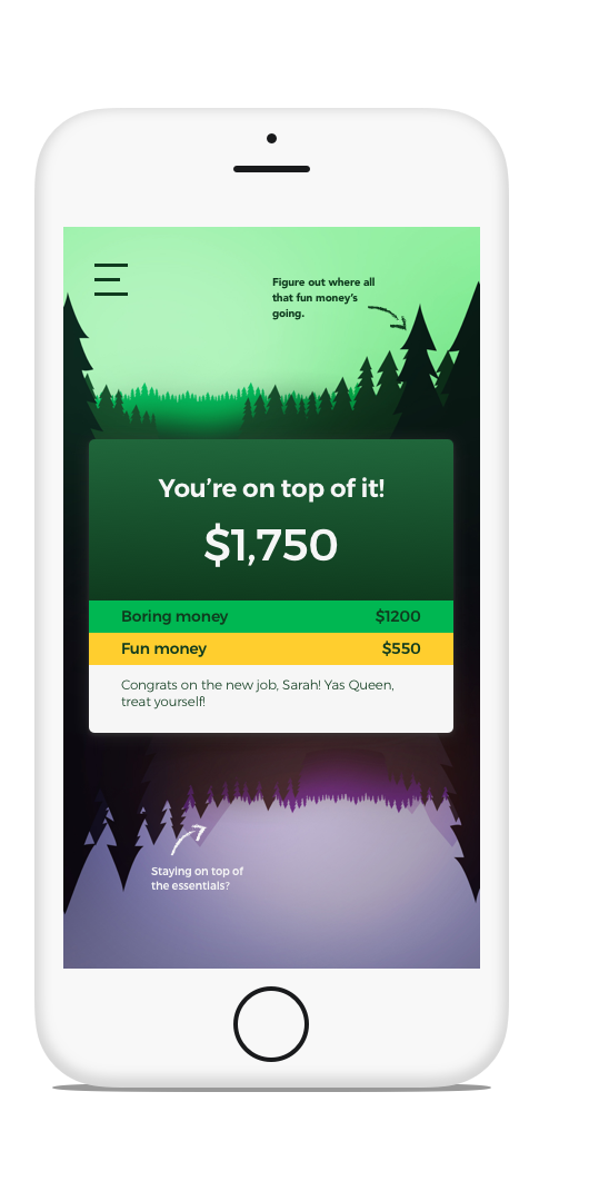
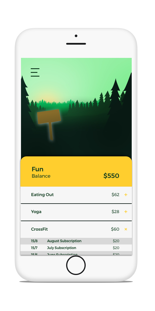
Flip is a fun, narrative based banking app that focuses on individual lifestyle choices and goals. It separates lifestyle (gym, art classes, dinner out etc.) and essential expenditures (rent, power, tax etc.) but shows the user that you can’t have one without the other. The brief that we received was to create a banking app targeting graduates entering the workforce for Co-operative Bank. The outline was to prioritise what a graduate might want from a new banking experience.
It’s completely personalised and creates a visual background narrative that reflects the state of your personal banking journey based off the on-boarding questionnaire the user answers when first using the app.
Within the narrative there are key scenes which provide key tips that support the user in relation to what they need most at the time to maintain a good work life balance. How these scenes work is one represents your lifestyle ‘fun’ money, and the other represents your essential expenditure ‘boring’ money and when you are looking at one, to see the other the user would need to swipe to ‘flip’ their scene upside down and see the other half of their money. Based off the tv show Stranger Things, the app would always have an ‘Upside Down’ that further emphasises the point you can’t have one aspect of money without the other.
Overall flip creates a complete holistic view of the users bank account providing a platform for graduates to balance wellbeing and finance in a supportive, engaging way.


Process
We started off with research and interviews and found that a graduates key worries are finding a good work life balance, finding a job and paying off student debt. While finding a job and paying off student debt are important we also found that graduates now are part of a generation that have the highest rates of depression and anxiety ever and so decided the strongest and most impactful thing to focus on with this app would be helping graduates facilitate a positive work life balance.


We then took this idea, of work life balance a little further. Brainstorming ideas, of how this could be shown. In this discussion we came up with the comparison of Stranger Things, and 'the upside-down'. With the normal world being fun, everyday financial choices which relate to lifestyle, and 'the upside-down' being bills, savings, etc.
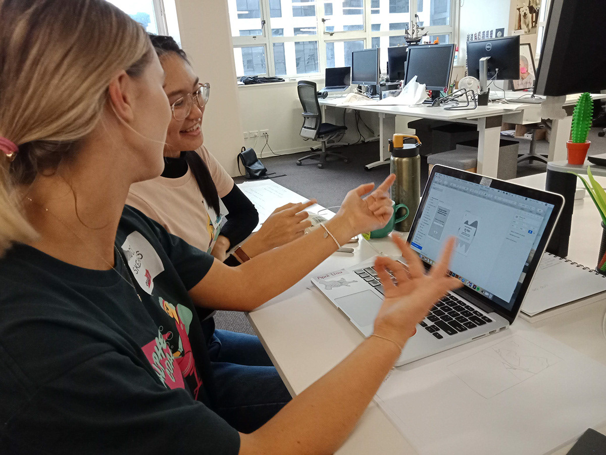
As the time frame was extremely tight we had little time for wire-framing and user testing. We initially started off with paper wireframes to work out how many screens we needed to make to get the idea across.
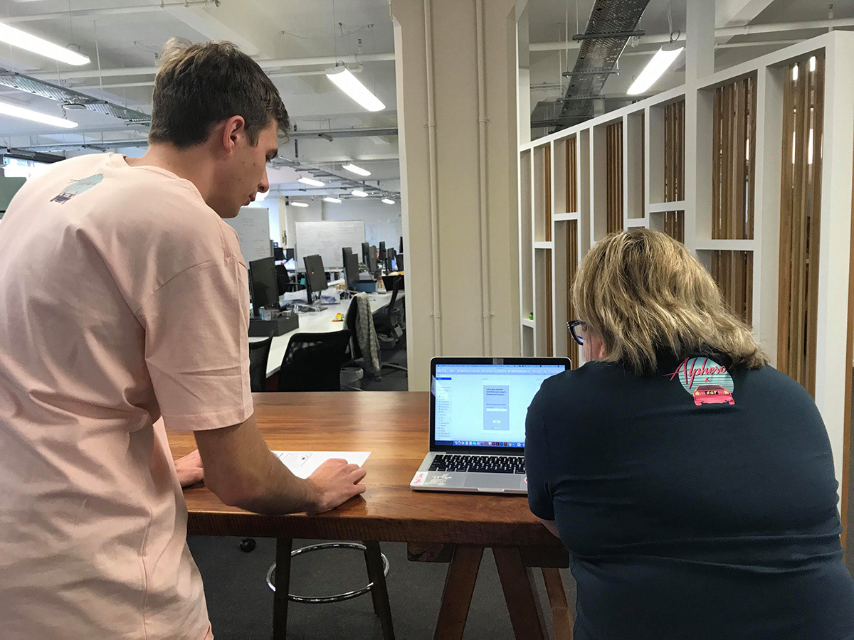
From there we started making basic wireframes and began to develop the UX of the app. While developing these wireframes we did user testing and found valuable insight into the way we use language and how that can affect what people understand when using the app. After further refining the UX we also started developing the visuals and drew a lot of inspiration from flat vector and low poly landscape illustrations.


My Role
Within our team I worked as an ideator, visual creator and user tester. As the timeframe was extremely tight we all shared the different roles throughout the day and often swapped tasks when needed.
Other team members:
Emma Macdonald: https://emmamacdonald.myportfolio.com
April Liu: http://april-liu.squarespace.com
Reflection
I thoroughly enjoyed this project and am proud of the outcome. It was great to be apart of a team with so much chemistry. I wish we had more to visually refine the app, however the time pressure made us the produce the bare essentials to communicate the idea.